Catchlight Painting is delighted to have Sally Zimmerman as a guest author on the blog. Sally is a Historic Preservation Consultant; she has been active in historic preservation activities in Boston and surrounding communities since the 1980s.
In her career as an architectural historian and preservation planner, Sally has worked in the municipal and non-profit sectors and has years of experience as a citizen member of local preservation commissions. Sally has been a frequent speaker on energy conservation in historic buildings and the use of historic paint colors for old houses.
Catchlight is honored to have Sally provide her unique insights on historic homes, design, and paint schemes from eras past.
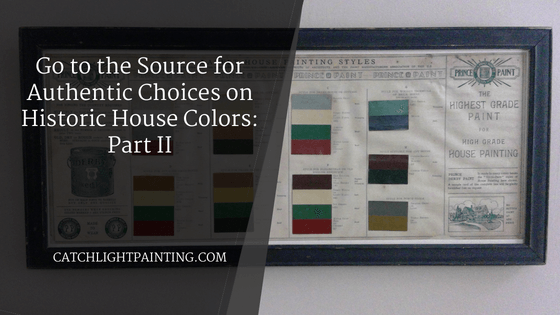
This is part II in the series produced by Sally – To see part I, click the link.
The color combinations in the framed brochure from part I, specify where the colors were to be used on the different architectural elements of the house. The six main color schemes each include four selections. Why four colors and not the three selections (Body, Trim, Accent) normally seen on paint advertising of today? Because, with historic house painting, before the universal use of asphalt shingles on roofs (which began to be widely marketed in the 1890s), a color was also required for coating wood shingle (or tin) roofs.
For the four-color recommendations, in addition to the roof color, the brochure lays out colors for “Body” (the siding color), “Trimming” (all the woodwork OTHER than the siding), and “Blind” (or shutter) colors. And what are these colors?
The most basic is Scheme A, with a light-toned gray-beige body, white trim, darker gray shutters, and a deep maroon-red roof. Another classic is Scheme C, with a medium gray body, ivory trim, deep green blinds, and again, a maroon-red roof. Scheme D, mentioned in part 1, would complement a brick ground floor with a rich golden tan on the upper story’s wooden siding, a cream color on the trim, and brighter green shutters, as well as a deep red roof.
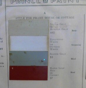
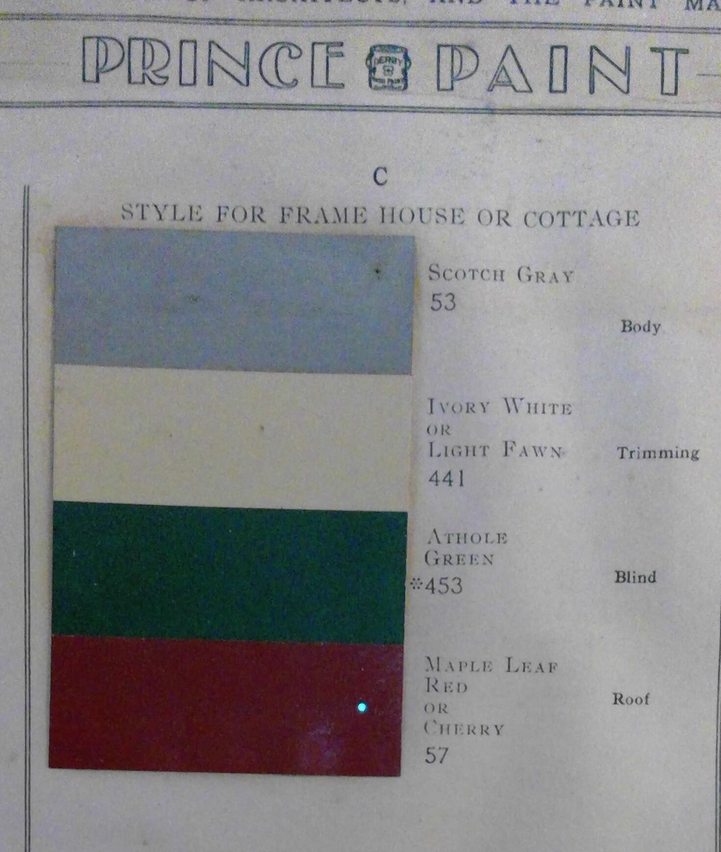
Scheme A (left, above) and Scheme C (right, above)
Scheme A was a modern look for ca. 1905, with a light neutral gray-beige body, white trim, darker gray shutters and a red roof (or accent). Scheme C has been a popular choice for decades: medium gray body, off-white trim, dark green shutters, and a red roof (or accent).
Scheme F (below) shows four swatches for an “Elizabethan” or “Old English” style house (now called Tudor Revival). Because these houses most often have stucco siding, which is the neutral “body” color, Prince Paint directed that Old English Brown or Seal Brown be used for “Timbers and Trimming” (i.e., the half-timbering of the stucco surfaces as well as around the frames of windows and doors) with Ivory White or Light Fawn (a pale beige) on the window sashes, Ivy Green shutters, and a Maple Leaf Red or Cherry roof (or accent).
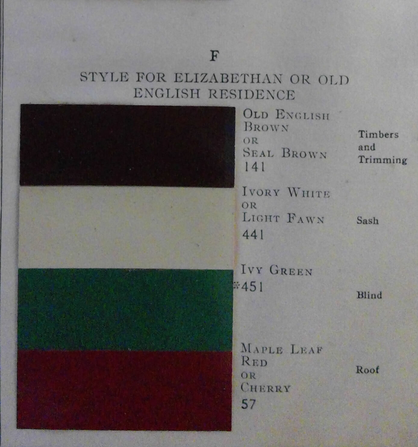
Scheme F: Style for Elizabethan or Old English Residence.
The colors here don’t include the stucco (or Body) color, but call instead for dark brown trim, off-white windows, green shutters, and a red roof.
Scholars who’ve worked with and tested similar historic paint advertisements with original color swatches know that such samples do shift in color over time depending on light exposure and chemical composition. This is particularly true of the linseed oil in early paint, which yellows and darkens over time, and of the yellow pigments in green paints, which tend to fade, causing the color to become more blue.
But in general, the overall paint schemes illustrated in the Prince Paints brochure can be readily recognized for the standard shades they represent. And the recommendations on where to use the colors on various houses hold true to our understanding of traditional practices for using color to call out the various architectural elements of the building.
Any of these combinations could be used with confidence today and successfully adapted to colors still popular now. But there’s no better way to understand what a “historic” paint scheme really is than by looking at what colors were recommended for use more than 100 years ago and using those colors in the combinations of their time, applying them on the building as they would have been then.
Be sure to read Sally’s follow-up piece, part III, on historic house colors, and click the links for more information on Victorian house painting and historic home restoration.