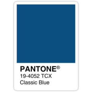
Pantone has announced a Color of the Year (COTY) every year for the past 20 years, and with each announcement, there is great speculation about the final choice. This year’s COTY was announced early last month amidst much fanfare at their annual event. The choice was Classic Blue, which Laurie Pressman, Vice President of the Pantone Color Institute (PCI), called, “a shade reminiscent of the sky at dusk,” according to CNN. She also said, “it’s a color that anticipates what’s going to happen next.”
Pantone’s first COTY, announced in 1999 for the year 2000, was also a blue, but Cerulean rather than Classic. In reference to this choice, Pressman said, “We were moving into Y2K and wondering: Is the world going to fall apart?” PCI stated that it recognized similar unrest and anxiety in the world today. They decided on a shade that offered reassurance and confidence as well as connection.
Pantone Color of the Year 2020 Announcement
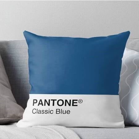
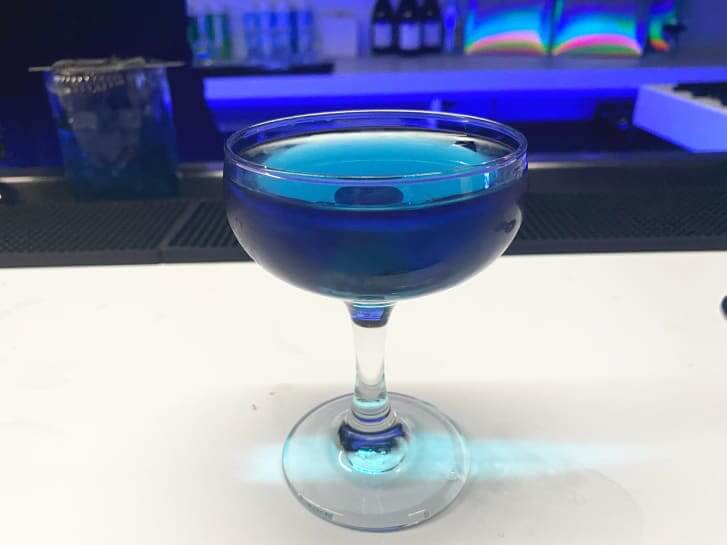
For their COTY announcement this year, Pantone created an experience that engulfed all five senses. They provided a fragrance, music, textured cushions, and drinks, all in Classic Blue.
What does Classic Blue smell like? “A contemplation of where sky and sea meet…an earthy, floral musk.”
What does Classic Blue taste like? “A wellness-oriented, elegant and expansive berry mélange with subtle citrus notes;” “Flowering vines…a sugary flavor evocative of blue raspberry syrup” (both a tea and a cocktail were created for the event).
What does Classic Blue feel like? “Soft…velvety…the feel of a brand new, plush couch.”
What does Classic Blue sound like? “Vivid nostalgia…an underwater, ethereal sound;” “a classic nostalgic song that takes us to a place of comfort and familiarity.”
As Pressman pointed out, the name of the color is of high importance. She cited “Brown Dirt vs. Chocolate Fudge” as an example. Both are shades of brown, but both conjure very different ideas. PCI chose a blue because blue is “imprinted on our psyches as a restful color [and] brings a sense of peace and tranquility to the human spirit, offering refuge.” They felt the shade re-centered our thoughts and fostered resilience, something a lot of people find themselves needing to employ in today’s turbulent times.
Leatrice Eiseman, Executive Director of the Pantone Color Institute, stated, “We are living in a time that requires trust and faith. It is this kind of consistency and confidence that is expressed by…Classic Blue, a solid and dependable blue hue we can always rely on…A boundless blue evocative of the vast and infinite evening sky, Classic Blue encourages us to look beyond the obvious to expand our thinking; challenging us to think more deeply, increase our perspective, and open the flow of communication.”
What is the Importance of the Color of the Year?
At the time PCI announced their first color of the year, they were taking a gamble, as they were hardly a household name. Now, 20 years on, they’ve permeated pop culture and people wait with bated breath to find out the next year’s color. Whatever shade PCI announces emerges in all areas of culture, from fashion to food. It has become somewhat of a self-fulfilling prophecy, and the success they’ve had enables them to keep making these yearly proclamations.
How do they determine the COTY? While the exact process is a closely held secret, research begins over a year in advance of the announcement. Inspiration is drawn from lifestyle and industry trends, which includes anything from art to media to travel destinations to political conditions. For those of us with access to HBO, it is interesting to note that Watchmen debuted in late October. Both the show, and the graphic novel it draws inspiration from, feature a superhuman named Dr. Manhattan, whose skin is…blue. It also features a line of products, originally a perfume, created by another character, which is called “Nostalgia.” Note that Pressman said this shade of blue conjures feeling of “nostalgia!” Also, as Michelle Ogundehin suggested in her article on Dezeen.com, “Blue is arguably the most democratic of colors.” In an age where a Republican President has just been impeached, the choice of a democratic color is interesting.
TIME pointed out that “the hue is both genderless and seasonless, making it both accessible and desirable, for people in all walks of life.” They also noted that Pressman said, “While some might associate [it] with nostalgia or convention, [it] may be emblematic of heritage, but highly contemporary, which is why it looks just as good when spotted on a hooded sweatshirt…as it does on a traditional suit.” Perhaps this is why Blue is already popping up in fashion from the red carpet to department stores.
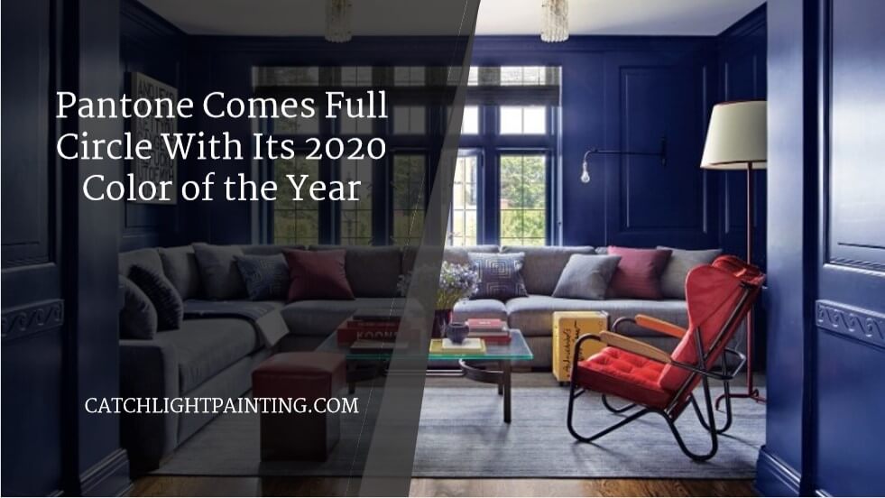
Classic Blue Paint Colors
If you’re thinking about adding Classic Blue to your life, there’s no better way than painting your home’s interior this latest fashion color. We looked at Benjamin Moore’s color collection page, and we found several shades that are very close to Classic Blue: Symphony Blue (2060-10), Downpour Blue (2063-20), Blueberry (2063-30), Patriot Blue (2064-20), Dark Royal Blue (2065-20), Brilliant Blue (2065-30), Blue (2066-10), and Evening Blue (2066-20).
Take advantage of our Winter Discount with an interior painting project this winter, and the Paint Is On The House! This includes any color, Classic Blue or otherwise, that you have in mind!